install.packages("ReliaPlotR")7 Interactive Plots with ReliaPlotR
7.1 Introduction
The previous chapters produce static base-R plots. ReliaPlotR (Govan 2023) is a companion package that turns those same fitted model objects into interactive plotly charts, with hover tooltips, zoom/pan controls, and built-in download buttons, without requiring you to change how you fit your models.
The API follows a single convention: pass the fitted object from WeibullR, ReliaGrowR, or WeibullR.ALT directly to the corresponding plotly_* function. The complete function map:
| Function | Input object | Source package | Chapter |
|---|---|---|---|
plotly_wblr() |
wblr |
WeibullR | Chapter 3 |
plotly_contour() |
wblr (with lrb bounds) |
WeibullR | Chapter 3 |
plotly_duane() |
duane |
ReliaGrowR | Chapter 4 |
plotly_rga() |
rga |
ReliaGrowR | Chapter 4 |
plotly_alt() |
alt.parallel |
WeibullR.ALT | Chapter 5 |
plotly_rel() |
alt.fit |
WeibullR.ALT | Chapter 5 |
plotly_nhpp() |
nhpp |
ReliaGrowR | Chapter 6 |
plotly_mcf() |
mcf |
ReliaGrowR | Chapter 6 |
plotly_exposure() |
exposure |
ReliaGrowR | Chapter 6 |
7.2 Installation
library(ReliaPlotR)
library(WeibullR)
library(ReliaGrowR)
library(WeibullR.ALT)
ReliaPlotR is available on CRAN: https://CRAN.R-project.org/package=ReliaPlotR
7.3 Life Data Analysis Plots
These functions accept the wblr objects produced by WeibullR, exactly as shown in Chapter 3. No reformatting needed.
Weibull Probability Plot: plotly_wblr()
Pass any fitted wblr object (or a list of objects for overlays):
failures <- c(30, 49, 82, 90, 96)
obj <- wblr.conf(wblr.fit(wblr(failures)))
plotly_wblr(obj, fitCol = "blue", confCol = "blue",
main = "Weibull Probability Plot")Hover over any point to read off its exact time and cumulative probability. The results table (β, η, Anderson-Darling) appears in the lower right.
Including suspensions:
suspensions <- c(100, 45, 10)
obj_susp <- wblr.conf(wblr.fit(wblr(failures, suspensions)))
plotly_wblr(obj_susp, susp = suspensions,
            fitCol = "red", confCol = "red",
main = "Weibull Plot with Suspensions")To overlay two models, pass a list:
obj1 <- wblr.conf(wblr.fit(wblr(failures,             col = "red")))
obj2 <- wblr.conf(wblr.fit(wblr(failures, suspensions, col = "purple")))
plotly_wblr(list(obj1, obj2),
            cols  = c("red", "purple"),
main = "Multi-Model Weibull Overlay")Contour Plot: plotly_contour()
Pass a wblr object fitted with likelihood-ratio bounds (method.conf = "lrb"):
obj_lrb <- wblr.conf(wblr.fit(wblr(failures, col = "blue"), method.fit = "mle"),
                     method.conf = "lrb")
plotly_contour(obj_lrb,
               main = "Weibull Contour Plot (90% CL)",
xlab = "Eta (η)", ylab = "Beta (β)")Hover to read off any (η, β) combination inside the confidence region. Overlaying multiple contours:
set.seed(123)
data <- data.frame(
  time = c(rweibull(5, 0.5, 20), rweibull(10, 1, 10), rweibull(5, 2, 5),
           rweibull(100, 2, 10)),
  event        = c(rep(1, 20), rep(0, 100)),
  failure_mode = c(rep("A", 5), rep("B", 10), rep("C", 5), rep("", 100))
)
dat1 <- dat2 <- dat3 <- data
dat1$event[dat1$failure_mode != "A"] <- 0
dat2$event[dat2$failure_mode != "B"] <- 0
dat3$event[dat3$failure_mode != "C"] <- 0

c1 <- wblr.conf(wblr.fit(wblr(dat1, col = "blue"),   method.fit = "mle"), method.conf = "lrb")
c2 <- wblr.conf(wblr.fit(wblr(dat2, col = "red"),    method.fit = "mle"), method.conf = "lrb")
c3 <- wblr.conf(wblr.fit(wblr(dat3, col = "orange"), method.fit = "mle"), method.conf = "lrb")

plotly_contour(list(c1, c2, c3),
               cols = c("blue", "red", "orange"),
main = "Contour Comparison: Three Failure Modes")7.4 Reliability Growth Plots
These functions accept fitted objects from ReliaGrowR, the same objects plotted in Chapter 4.
Duane Plot: plotly_duane()
times    <- c(100, 200, 300, 400, 500)
failures <- c(1, 2, 1, 3, 2)

fit_duane <- duane(times, failures)
plotly_duane(fit_duane,
             main = "Duane Reliability Growth",
             xlab = "Cumulative Time",
ylab = "Cumulative MTBF")Crow-AMSAA Plot: plotly_rga()
fit_rga <- rga(times, failures)
plotly_rga(fit_rga,
           main = "Crow-AMSAA Model",
           xlab = "Cumulative Time",
ylab = "Cumulative Failures")Hover over any data point to read the exact cumulative time and failure count. The fitted curve and confidence bounds can be toggled via the legend.
7.5 Accelerated Life Testing Plots
These functions accept alt.make() and alt.fit() objects from WeibullR.ALT; see Chapter 5.
ALT Probability Plot: plotly_alt()
t41    <- NelsonData("table4.1")
set170 <- alt.data(t41$C170f, s = t41$C170s, stress = 170)
set190 <- alt.data(t41$C190f, s = t41$C190s, stress = 190)
set220 <- alt.data(t41$C220f, s = t41$C220s, stress = 220)

arrobj <- alt.make(list(set170, set190, set220),
                   dist = "lognormal", alt.model = "arrhenius",
                   method.fit = "mle-rba")
prlobj <- alt.parallel(arrobj, view_parallel_fits = FALSE)

plotly_alt(prlobj,
           main = "Arrhenius-Lognormal ALT Probability Plot",
           xlab = "Time to Failure (hours)",
           ylab = "Probability of Failure")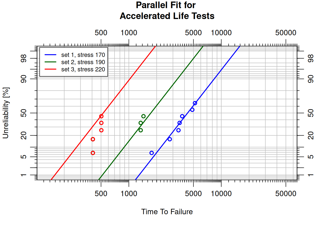
Each color represents a different temperature level. Hover to inspect unreliability at any time. Note: plotly_alt() requires a parallelized object from alt.parallel().
Life-Stress Relationship Plot: plotly_rel()
lnrobj <- alt.fit(prlobj)
plotly_rel(lnrobj,
           main = "Life-Stress Relationship: Arrhenius Model",
           xlab = "Temperature (°C)",
ylab = "Time to Failure")Each line represents a percentile of the failure distribution (P10, P63.2, P90, etc.). Hover over any point to read the expected life at that stress level and percentile.
Power Law–Weibull ALT Plots
The Power Law model applies to non-thermal stress (voltage, load, pressure). Here, electrical insulating fluids are tested at seven voltage levels (Nelson Table 3.1; see Chapter 5):
data_nelson <- NelsonData("table3.1")
data26 <- alt.data(data_nelson$kV26, stress = 26)
data28 <- alt.data(data_nelson$kV28, stress = 28)
data30 <- alt.data(data_nelson$kV30, stress = 30)
data32 <- alt.data(data_nelson$kV32, stress = 32)
data34 <- alt.data(data_nelson$kV34, stress = 34)
data36 <- alt.data(data_nelson$kV36, stress = 36)
data38 <- alt.data(data_nelson$kV38, stress = 38)

pwrobj <- alt.make(list(data26, data28, data30, data32, data34, data36, data38),
                   dist = "weibull", alt.model = "power")
expobj <- alt.parallel(pwrobj, view_parallel_fits = FALSE)

plotly_alt(expobj,
           main = "Power Law–Weibull ALT Probability Plot",
           xlab = "Time to Failure",
           ylab = "Probability of Failure")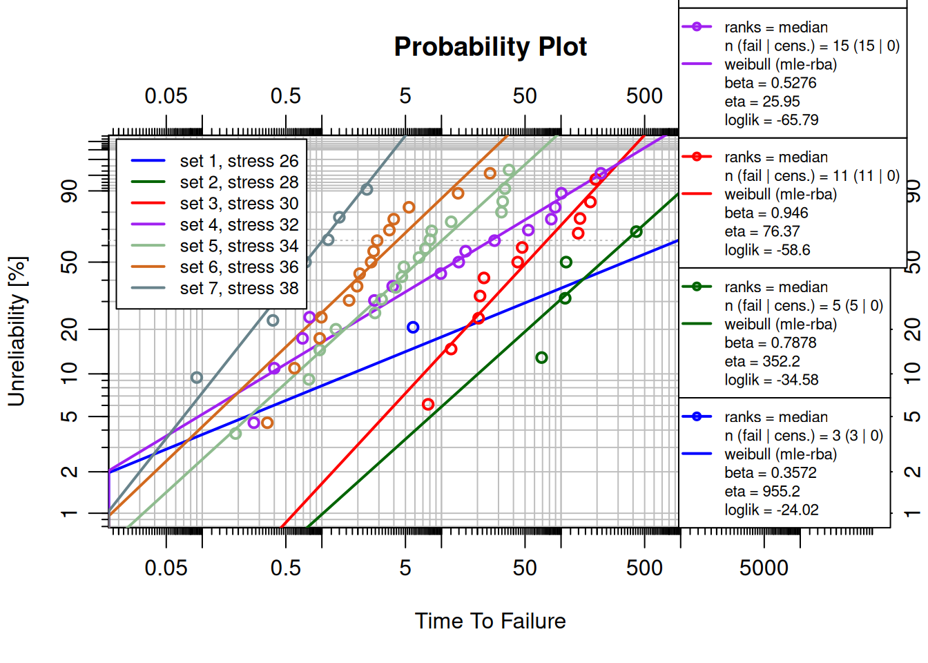
pwrrobj <- alt.fit(expobj)
plotly_rel(pwrrobj,
           main = "Life-Stress Relationship: Power Law Model",
           xlab = "Voltage (kV)",
ylab = "Time to Failure")7.6 Repairable Systems Plots
These functions accept the fitted objects from ReliaGrowR, the same objects produced in Chapter 6. The section introduces the pump_data fleet dataset first via the non-parametric tools, then uses the same data for the parametric NHPP fit.
Exposure Plot: plotly_exposure()
pump_data <- data.frame(
  id    = c(1, 1, 1,  2, 2, 2,  3, 3,  4, 4, 4, 4,  5, 5),
  time  = c(310, 850, 1620,  420, 1050, 2100,  580, 1890,
            240, 710, 1380, 2400,  530, 1740),
  event = rep(1, 14)
)

exp_result <- exposure(id = pump_data$id, time = pump_data$time,
                       event = pump_data$event)
plotly_exposure(exp_result,
                main = "Fleet Exposure Plot",
                xlab = "Operating Hours",
ylab = "Event Rate (failures / hour)")MCF Plot: plotly_mcf()
end_times  <- c("1" = 3000, "2" = 3000, "3" = 3000, "4" = 3000, "5" = 3000)

mcf_result <- mcf(id = pump_data$id, time = pump_data$time,
                  event = pump_data$event, end_time = end_times)
plotly_mcf(mcf_result,
           main = "MCF: Industrial Pump Fleet",
           xlab = "Operating Hours",
ylab = "Expected Cumulative Failures per System")NHPP Plot: plotly_nhpp()
The parametric Crow-AMSAA fit uses the same pump_data fleet; individual failure times are extracted and sorted across all systems:
failure_times <- sort(pump_data$time[pump_data$event == 1])

fit_nhpp <- nhpp(time = failure_times, event = rep(1, length(failure_times)))
plotly_nhpp(fit_nhpp,
            main = "Crow-AMSAA: Industrial Pump Fleet",
            xlab = "Operating Hours",
ylab = "Cumulative Failures")7.7 Embedding in Reports and Dashboards
ReliaPlotR outputs are standard plotly objects and embed natively in:
Quarto / R Markdown: interactive widgets in HTML output, static fallback in PDF:
```{r}
library(ReliaPlotR)
library(WeibullR)
failures <- c(30, 49, 82, 90, 96)
obj <- wblr.conf(wblr.fit(wblr(failures)))
plotly_wblr(obj)
```Shiny: use plotlyOutput() / renderPlotly():
library(shiny)
library(plotly)
library(ReliaPlotR)
library(WeibullR)

ui <- fluidPage(plotlyOutput("wblr_plot"))

server <- function(input, output) {
  output$wblr_plot <- renderPlotly({
    obj <- wblr.conf(wblr.fit(wblr(c(30, 49, 82, 90, 96))))
    plotly_wblr(obj)
  })
}

shinyApp(ui, server)
7.8 When to Use ReliaPlotR
| Use ReliaPlotR when… | Use base WeibullR / ReliaGrowR plots when… |
|---|---|
| Delivering results to non-R stakeholders | Running quick exploratory analysis in a script |
| Embedding in an HTML report or dashboard | Generating PDF / print output directly |
| Stakeholders need to hover and inspect points | Batch-processing many analyses |
| Presenting in a web browser or Shiny app | Working in a non-HTML environment |
7.9 Getting Help
help(package = "ReliaPlotR")7.10 Summary
ReliaPlotR wraps every major fitted object in the ReliaLearnR ecosystem, including wblr, duane, rga, nhpp, mcf, exposure, alt.make, and alt.fit, in an interactive plotly chart. The pattern is consistent: fit your model with WeibullR, ReliaGrowR, or WeibullR.ALT as usual, then pass the result to the corresponding plotly_* function. All nine functions support the same customization arguments (titles, axis labels, colors, grid control) and return standard plotly objects compatible with Quarto, R Markdown, and Shiny.
Govan, Paul. 2023. ReliaPlotR: Interactive Reliability Analysis Plots. https://doi.org/10.32614/CRAN.package.ReliaPlotR.