# Life Data Analysis {#sec-lda}
## Introduction
**Life Data Analysis** is the study of how systems function over time. Life data tells us how long a system will last, when it will likely fail, and how often it will need maintenance. In reliability engineering it is often called **Weibull analysis** because the Weibull distribution is the dominant model [@Weibull].
## Learning Objectives
By the end of this chapter, you will be able to:
- Describe the purpose of Weibull analysis in reliability engineering.
- Differentiate between types of data censoring: right-censored and interval-censored.
- Differentiate between Weibull models: 2-parameter, 3-parameter, and Weibayes.
- Apply Median Rank Regression (MRR) and Maximum Likelihood Estimation (MLE).
- Compare Weibull and lognormal fits using goodness-of-fit statistics.
- Determine how many failures are needed for reliable Weibull estimates.
- Interpret results using probability plots and contour plots.
## Life Distributions
### The Weibull Distribution
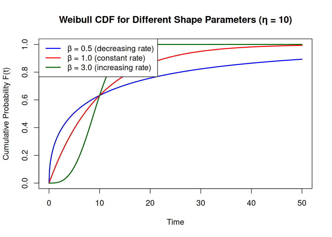
The **Weibull distribution** is a flexible continuous probability distribution widely used in life data analysis. Its flexibility comes from a shape parameter $\beta$ that allows it to mimic the normal, exponential, and log-normal distributions.
### The Reliability (Survival) Function
The Weibull **reliability** (survival) function is:
$$R(t) = e^{-(t/\eta)^\beta}$$
where $R(t)$ is the probability of *surviving beyond* time $t$, $\beta$ is the shape parameter, and $\eta$ is the scale parameter. The **CDF** (cumulative probability of failure by time $t$) is its complement: $F(t) = 1 - R(t)$.
The shape parameter $\beta$ has a direct physical interpretation:
| $\beta$ | Failure rate | Typical cause |
|:---:|---|---|
| $< 1$ | Decreasing | Infant mortality |
| $= 1$ | Constant | Random failures (exponential) |
| $> 1$ | Increasing | Wear-out (fatigue, corrosion, aging) |
```{r}
t    <- seq(0, 50, by = 0.1)
etas <- 10

# Plot CDFs for three values of beta
plot(t, pweibull(t, shape = 0.5, scale = etas), type = "l", col = "blue",  lwd = 2,
     xlab = "Time", ylab = "Cumulative Probability F(t)",
     main = "Weibull CDF for Different Shape Parameters (η = 10)",
     ylim = c(0, 1))
lines(t, pweibull(t, shape = 1.0, scale = etas), col = "red",       lwd = 2)
lines(t, pweibull(t, shape = 3.0, scale = etas), col = "darkgreen", lwd = 2)
legend("topleft",
       legend = c("β = 0.5 (decreasing rate)", "β = 1.0 (constant rate)",
                  "β = 3.0 (increasing rate)"),
       col = c("blue", "red", "darkgreen"), lwd = 2)
```
**Key property**: at $t = \eta$, $F(\eta) = 1 - e^{-1} \approx 63.2\%$ for any value of $\beta$. This is why $\eta$ is called the **characteristic life**.
::: {.callout-tip}
## Review
Which value of $\beta$ indicates an increasing failure rate?
<details><summary>Answer</summary>
$\beta > 1$. A shape parameter greater than 1 indicates a wear-out failure mode where the failure rate increases over time.
</details>
:::
## WeibullR
The `WeibullR` package [@WeibullR; @Silkworth2020] is the primary R tool for Weibull analysis.
### Getting Started
```{r}
#| eval: false
install.packages("WeibullR")
```
```{r}
library(WeibullR)
```
### Fitting a Weibull Model
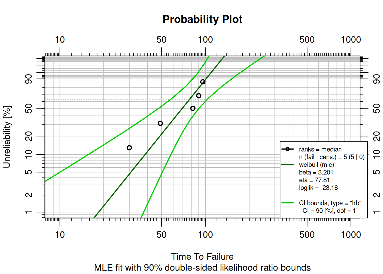
A factory has 5 machines that failed at times 30, 49, 82, 90, and 96. Use `MLEw2p()` to fit a 2-parameter Weibull model using Maximum Likelihood Estimation and display the probability plot.
```{r}
failures <- c(30, 49, 82, 90, 96)
fit <- MLEw2p(failures, bounds = TRUE, show = TRUE)
```
### Reading the Probability Plot
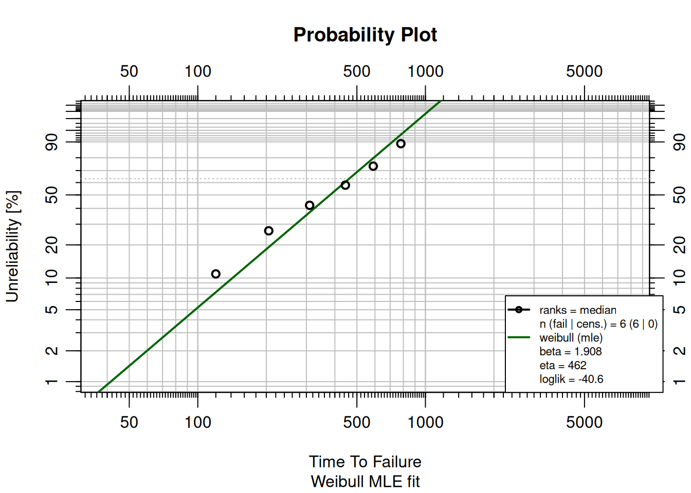
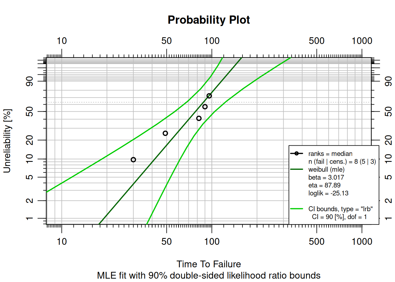
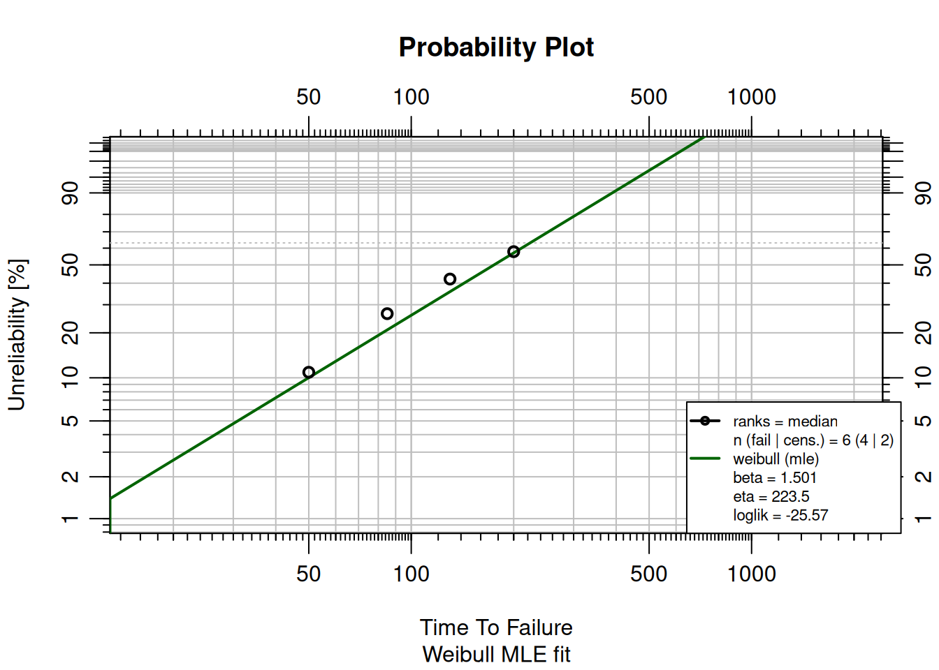
The **Weibull probability plot** shows time on the horizontal axis (log scale) and cumulative unreliability $F(t)$ on the vertical axis (log-log scale). This double-log transformation linearizes Weibull data; the result is a straight line when the Weibull model fits.
- Read off $F(t)$ at any time to get the probability of failure by that time.
- Reliability at time $t$ is $R(t) = 1 - F(t)$.
- $\beta$ (shape) and $\eta$ (scale) are shown in the legend.
::: {.callout-note}
## Try It
A batch of industrial pumps failed at times (hours): 120, 205, 310, 445, 590, 780. Use `MLEw2p()` to fit a 2-parameter Weibull model.
```{r}
failures <- c(120, 205, 310, 445, 590, 780)
# fit <- MLEw2p(failures, show = TRUE)
```
<details><summary>Solution</summary>
```{r}
failures <- c(120, 205, 310, 445, 590, 780)
fit <- MLEw2p(failures, show = TRUE)
```
</details>
:::
## Data Censoring
In life data analysis, data is often **censored**: the exact time to failure is not known for all units.
### Right-Censored Data (Suspensions)
**Right censoring** occurs when a unit has operated for a period of time without failing (a **suspension**). The unit was removed from service before failing.
```{r}
failures    <- c(30, 49, 82, 90, 96)
suspensions <- c(100, 45, 10)
fit <- MLEw2p(failures, suspensions, bounds = TRUE, show = TRUE)
```
Adding suspensions changes the fit: the model accounts for units that survived longer, adjusting $\beta$ and $\eta$ accordingly.
::: {.callout-note}
## Try It
Four compressors failed at 50, 85, 130, and 200 hours. Two additional units were removed at 250 hours without failing. Fit a Weibull model with suspensions.
```{r}
failures    <- c(50, 85, 130, 200)
suspensions <- c(250, 250)
# fit <- MLEw2p(failures, suspensions, show = TRUE)
```
<details><summary>Solution</summary>
```{r}
failures    <- c(50, 85, 130, 200)
suspensions <- c(250, 250)
fit <- MLEw2p(failures, suspensions, show = TRUE)
```
</details>
:::
### Interval-Censored Data
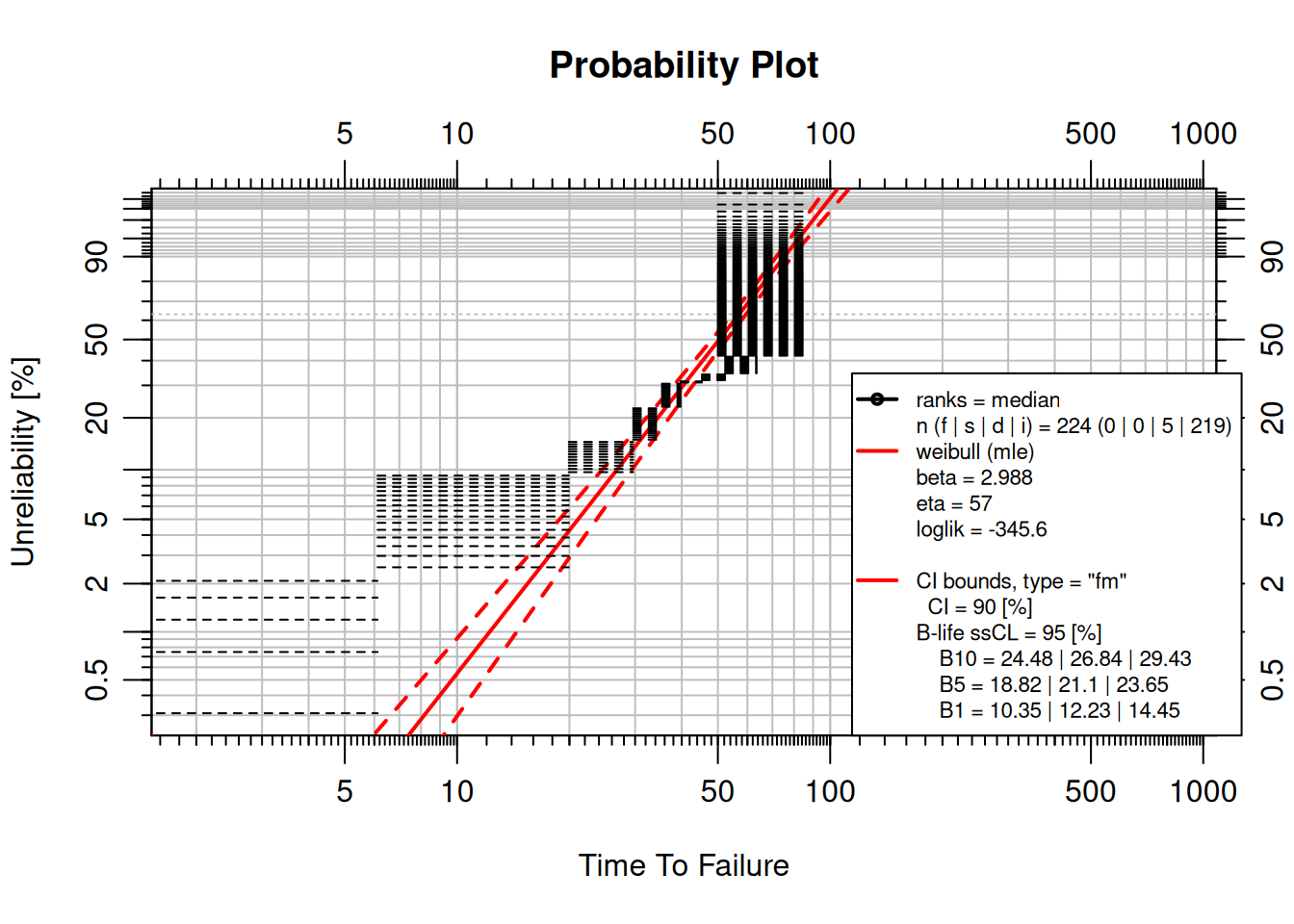
**Interval censoring** occurs when failures are only detected during periodic inspections; the exact failure time is unknown, but it is known to have occurred within an interval.
```{r}
#| warning: false
inspection_data <- data.frame(
  left  = c(0, 6.12, 19.92, 29.64, 35.4, 39.72, 45.32, 52.32),
  right = c(6.12, 19.92, 29.64, 35.4, 39.72, 45.32, 52.32, 63.48),
  qty   = c(5, 16, 12, 18, 18, 2, 6, 17)
)
suspensions <- data.frame(time = 63.48, event = 0, qty = 73)

obj1 <- wblr(suspensions, interval = inspection_data)
obj1 <- wblr.fit(obj1, method.fit = "mle", col = "red")
obj1 <- wblr.conf(obj1, method.conf = "fm", lty = 2)
plot(obj1)
```
Black horizontal lines represent the inspection intervals; the solid red line is the model fit; dashed red lines are confidence bounds.
### Grouped Data
Life data is often collected in groups. The `qty` column in the inspection data above indicates how many units failed in each interval: 5 failed between time 0 and 6.12, 16 between 6.12 and 19.92, and so on.
::: {.callout-tip}
## Review
In the interval-censored example above, how many total failures occurred?
<details><summary>Answer</summary>
$5 + 16 + 12 + 18 + 18 + 2 + 6 + 17 = 94$ failures. The 73 suspensions were units that did not fail by the last inspection time (63.48). Total units in the dataset: $94 + 73 = 167$.
</details>
:::
## Parameter Estimation Methods
### MRR vs MLE
**Median Rank Regression (MRR)** estimates parameters by minimizing the sum of squared errors between observed and predicted values (least squares).
**Maximum Likelihood Estimation (MLE)** finds the parameters that make the observed data most probable: it maximizes the likelihood function.
Comparing both methods on the same data:
```{r}
failures    <- c(30, 49, 82, 90, 96)
suspensions <- c(100, 45, 10)

MRRfit <- wblr.fit(wblr(failures, suspensions, col = "blue"), method.fit = "rr")
MLEfit <- wblr.fit(wblr(failures, suspensions, col = "red"),  method.fit = "mle")
plot.wblr(list(MRRfit, MLEfit))
```
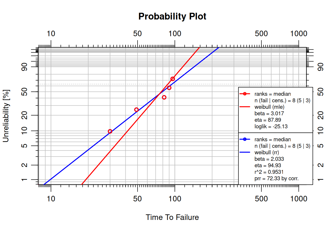
Both methods fit the same data. Slight differences in $\beta$ and $\eta$ are visible; the better fit can be determined objectively using the Anderson-Darling statistic. In practice, **MLE is preferred for small samples and censored data** (it uses all the information in the likelihood); **MRR is adequate for larger, complete datasets** and is computationally simpler.
## Goodness of Fit
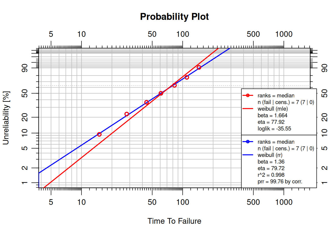
The **Anderson-Darling (AD) statistic** measures how closely the fitted CDF matches the empirical distribution. A **lower AD** value indicates a better fit:
| AD Value | Interpretation |
|---|---|
| < 0.3 | Good fit |
| 0.3 – 0.6 | Acceptable fit |
| > 0.6 | Poor fit |
WeibullR displays the AD statistic in the plot legend. Use it to compare fitting methods or distributions.
::: {.callout-note}
## Try It
Fit the following failure data with both MRR and MLE, then compare their AD statistics on a combined probability plot.
```{r}
failures <- c(15, 28, 44, 61, 83, 110, 145)
```
<details><summary>Solution</summary>
```{r}
failures <- c(15, 28, 44, 61, 83, 110, 145)
obj_mrr <- wblr.fit(wblr(failures, col = "blue"), method.fit = "rr")
obj_mle <- wblr.fit(wblr(failures, col = "red"),  method.fit = "mle")
plot.wblr(list(obj_mrr, obj_mle))
```
</details>
:::
## Choosing a Distribution
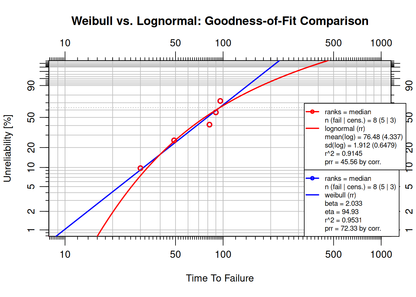
The Weibull distribution is the default in reliability engineering, but it is not always the best fit. The **lognormal** distribution often fits failure data driven by fatigue crack growth, corrosion, or cumulative damage, mechanisms where the logarithm of time-to-failure is normally distributed.
| Distribution | When it tends to fit best |
|---|---|
| Weibull | Wear-out, mechanical fatigue, early-life failures |
| Lognormal | Corrosion, fatigue crack propagation, electronic degradation |
`wblr.fit()` supports both via the `dist` argument. The goodness-of-fit metric in the plot legend ($r^2$ for rank regression) is the tiebreaker: **higher $r^2$ indicates a better fit**:
```{r}
failures    <- c(30, 49, 82, 90, 96)
suspensions <- c(100, 45, 10)

obj_wb <- wblr.fit(wblr(failures, suspensions, col = "blue"),
                   method.fit = "rr")
obj_ln <- wblr.fit(wblr(failures, suspensions, col = "red"),
                   method.fit = "rr", dist = "lognormal")

plot.wblr(list(obj_wb, obj_ln),
          main = "Weibull vs. Lognormal: Goodness-of-Fit Comparison")
```
For this dataset, Weibull achieves $r^2 \approx 0.953$ vs. lognormal at $r^2 \approx 0.914$; Weibull fits better. The choice should be driven by the data, not by habit.
::: {.callout-note}
## Try It
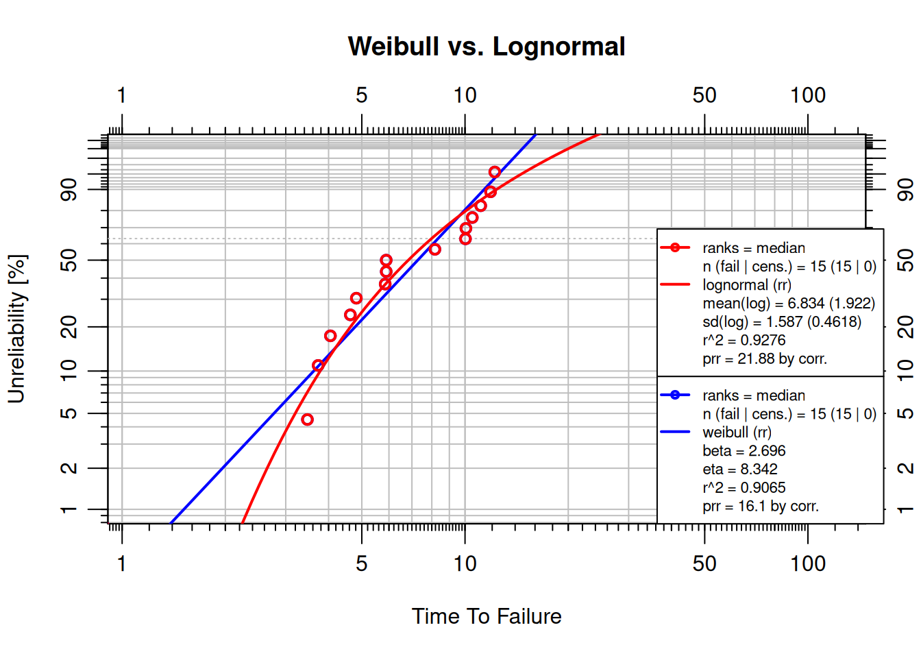
Fit the 3-parameter Weibull failure dataset below with both Weibull and lognormal distributions. Which fits better?
```{r}
failures_3p <- c(3.47, 3.73, 4.05, 4.63, 4.82, 5.85, 5.89, 5.89,
                 8.17, 10.03, 10.06, 10.50, 11.11, 11.87, 12.21)
# obj_wb <- wblr.fit(wblr(failures_3p, col = "blue"), method.fit = "rr")
# obj_ln <- wblr.fit(wblr(failures_3p, col = "red"),
#                    method.fit = "rr", dist = "lognormal")
# plot.wblr(list(obj_wb, obj_ln))
```
<details><summary>Solution</summary>
```{r}
failures_3p <- c(3.47, 3.73, 4.05, 4.63, 4.82, 5.85, 5.89, 5.89,
                 8.17, 10.03, 10.06, 10.50, 11.11, 11.87, 12.21)
obj_wb <- wblr.fit(wblr(failures_3p, col = "blue"), method.fit = "rr")
obj_ln <- wblr.fit(wblr(failures_3p, col = "red"),
                   method.fit = "rr", dist = "lognormal")
plot.wblr(list(obj_wb, obj_ln),
          main = "Weibull vs. Lognormal")
```
Compare the $r^2$ values in the legend. For this dataset the lognormal often achieves a slightly higher $r^2$, suggesting cumulative-damage behavior, where the logarithm of time-to-failure is approximately normally distributed.
</details>
:::
## Sample Size Considerations
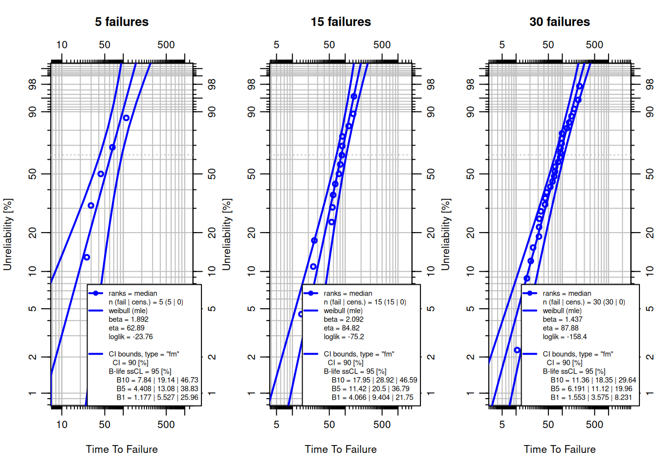
Weibull parameter estimates are most reliable when based on at least 10–15 **observed failures**. With fewer failures, uncertainty grows substantially: confidence bounds widen, $r^2$ loses discriminating power, and estimated $\beta$ and $\eta$ can deviate significantly from the true values.
The following code simulates datasets of different sizes from the same Weibull ($\beta = 2$, $\eta = 100$) and fits each, showing how confidence bounds tighten as sample size increases:
```{r}
set.seed(42)
eta_true <- 100; beta_true <- 2

par(mfrow = c(1, 3))
for (n in c(5, 15, 30)) {
  f   <- sort(rweibull(n, shape = beta_true, scale = eta_true))
  obj <- wblr.conf(wblr.fit(wblr(f, col = "blue"), method.fit = "mle"),
                   method.conf = "fm")
  plot(obj, main = paste0(n, " failures"))
}
par(mfrow = c(1, 1))
```
With only 5 failures the confidence bounds span most of the probability axis. At 30 failures they are narrow enough for confident decision-making.
**Practical guidance:**
| Failures observed | Guidance |
|---|---|
| $< 5$ | Estimates unreliable; use Weibayes (fix $\beta$ from prior knowledge) |
| 5–10 | Usable with caution; widen safety margins |
| 10–20 | Acceptable for most engineering decisions |
| $> 20$ | Reliable estimates; confidence bounds are tight |
When fewer than 5 failures are available, the Weibayes model (next section) provides a structured way to incorporate prior knowledge about $\beta$.
## Other Weibull Models
### The Weibayes Model
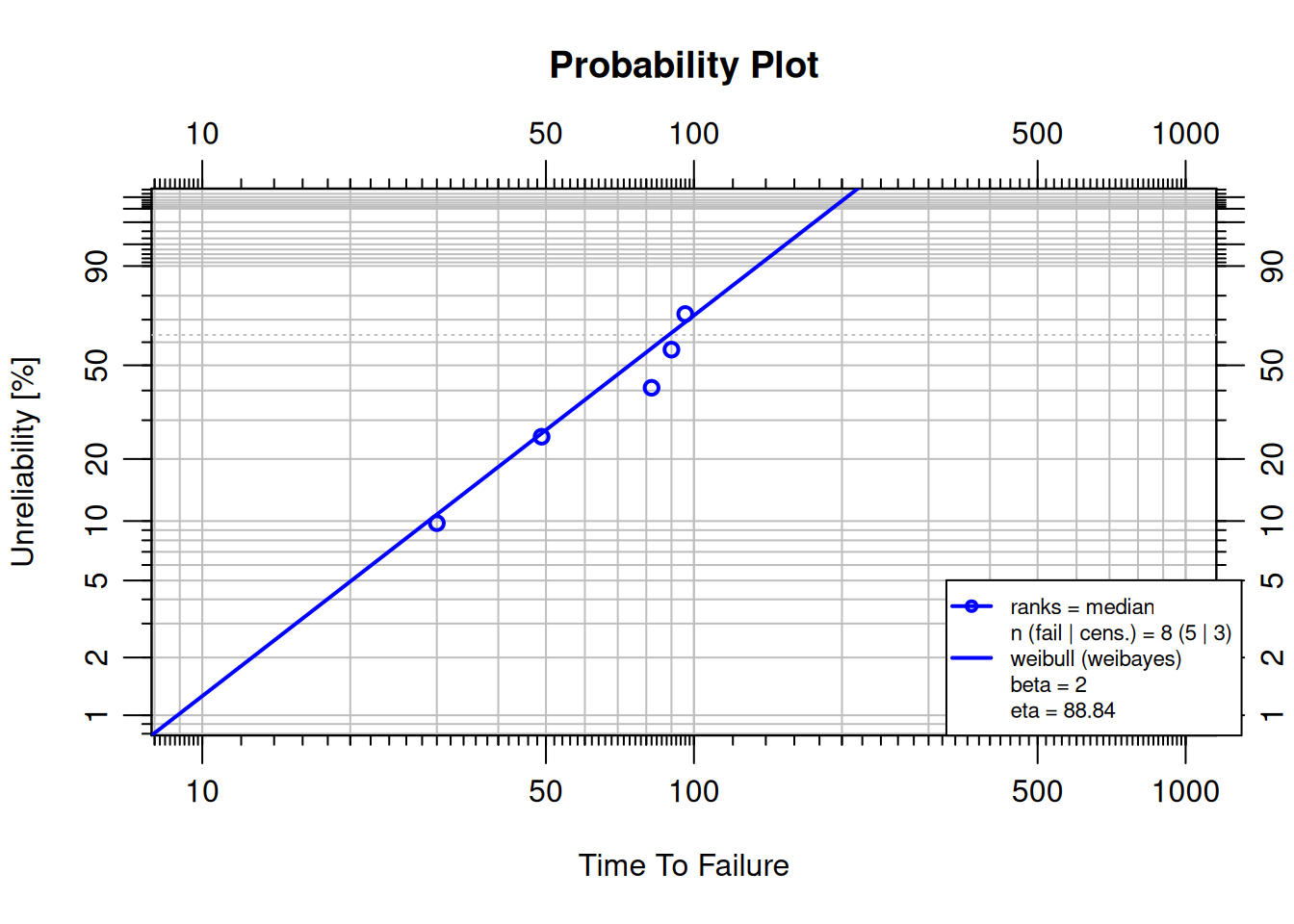
A **Weibayes** (one-parameter Weibull) has a fixed $\beta$ based on prior knowledge or experience. This is appropriate when failure data are scarce.
```{r}
#| warning: false
failures    <- c(30, 49, 82, 90, 96)
suspensions <- c(100, 45, 10)

obj <- wblr.fit(wblr(failures, suspensions, col = "blue"),
                method.fit = "weibayes", weibayes.beta = 2)
plot(obj)
```
Confidence bounds are not shown for Weibayes because $\beta$ is fixed by assumption.
### The 3-Parameter Weibull
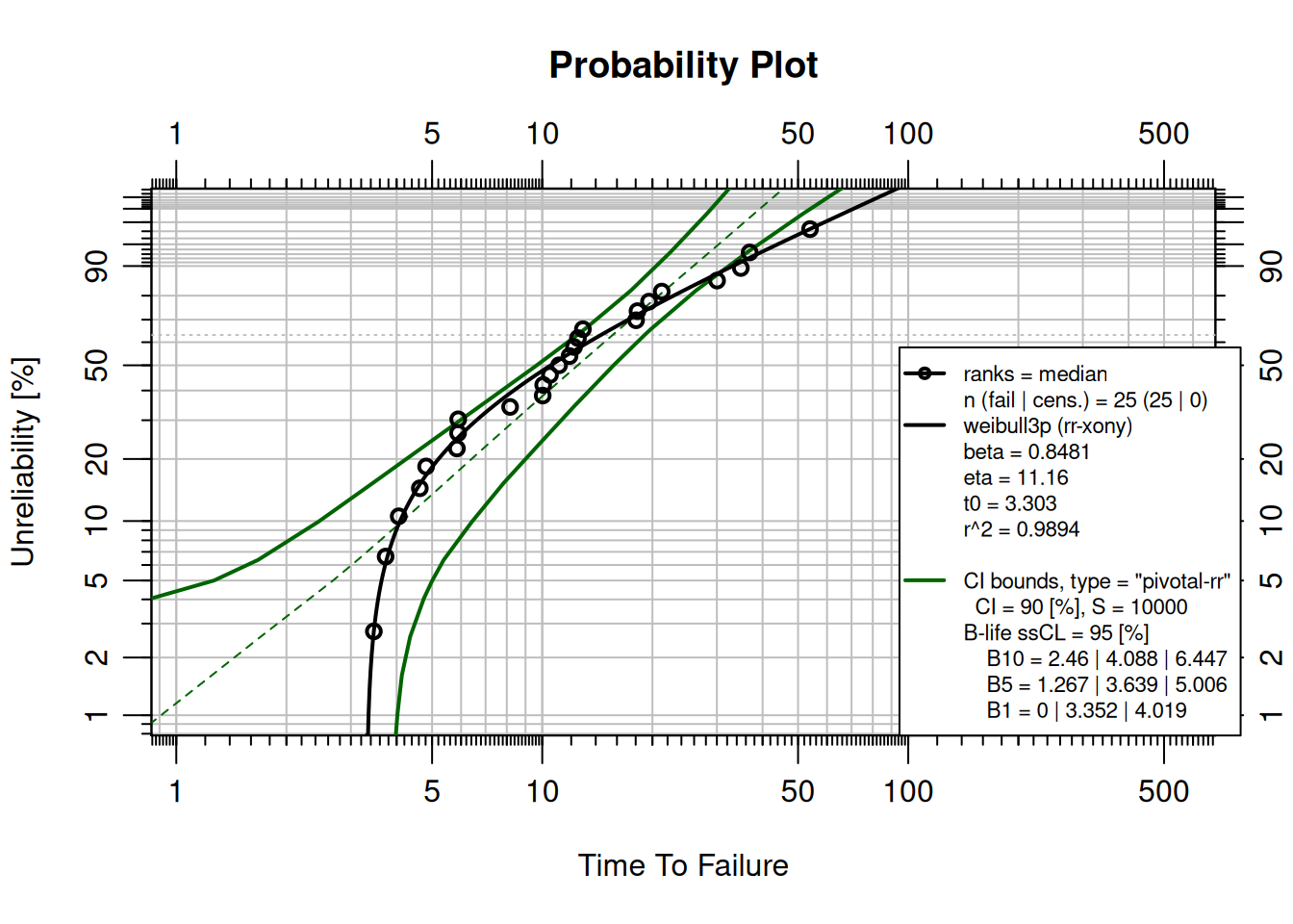
The **3-parameter Weibull** adds a failure-free period $t_0$, the time before which no failures can occur:
$$R(t) = e^{-((t - t_0)/\eta)^\beta}$$
This is appropriate for components that must age, wear, or fatigue before they can fail.
```{r}
failures_3p <- c(
  3.46623,  3.73271,  4.05300,  4.62870,  4.81570,
  5.84517,  5.88831,  5.89297,  8.16836, 10.02799,
 10.06062, 10.49785, 11.11493, 11.87369, 12.21122,
 12.51854, 12.91357, 18.04246, 18.20712, 19.57305,
 21.20873, 30.03917, 34.88001, 36.87355, 53.91168
)

fit_3p <- wblr.conf(wblr.fit(wblr(failures_3p), dist = "weibull3p"), col = "darkgreen")
plot(fit_3p)
```
The failure-free period is approximately 3.3 time units, visible as the curve flattening at low probabilities.
## Multi-Plots
Multi-plots overlay multiple Weibull fits on one chart, making comparisons easy.
```{r}
failures    <- c(30, 49, 82, 90, 96)
suspensions <- c(100, 45, 10)

obj1 <- wblr.fit(wblr(failures),             col = "red")
obj2 <- wblr.fit(wblr(failures, suspensions), col = "purple")

plot.wblr(list(obj1, obj2))
```
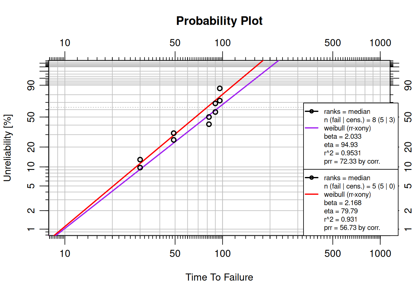
The red model (without suspensions) has a higher beta and lower eta than the purple model (with suspensions). Adding suspensions shifts the fitted distribution to account for units that survived longer than the observed failures.
## Competing Failure Modes
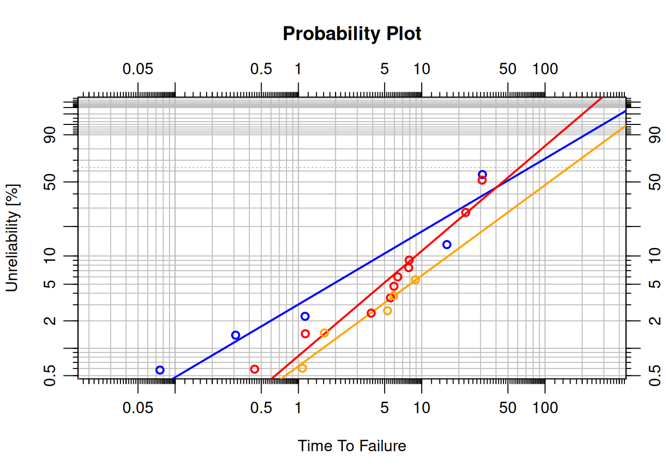
When a component can fail in several distinct ways (corrosion, fatigue, overload), fitting a single Weibull to the combined data produces a poor fit because each mode has its own distribution.
The approach: fit a separate Weibull to each failure mode, treating failures from other modes as suspensions.
```{r}
set.seed(123)
data <- data.frame(
  time = c(
    rweibull(5,   0.5, 20),   # Failure Mode A
    rweibull(10,  1,   10),   # Failure Mode B
    rweibull(5,   2,    5),   # Failure Mode C
    rweibull(100, 2,   10)    # Suspensions
  ),
  event = c(rep(1, 20), rep(0, 100)),
  failure_mode = c(rep("A", 5), rep("B", 10), rep("C", 5), rep("", 100))
)

# Separate dataset per failure mode (others treated as suspensions)
dat1 <- dat2 <- dat3 <- data
dat1$event[dat1$failure_mode != "A"] <- 0
dat2$event[dat2$failure_mode != "B"] <- 0
dat3$event[dat3$failure_mode != "C"] <- 0

obj1 <- wblr.fit(wblr(dat1, col = "blue"))
obj2 <- wblr.fit(wblr(dat2, col = "red"))
obj3 <- wblr.fit(wblr(dat3, col = "orange"))
plot.wblr(list(obj1, obj2, obj3), is.plot.legend = FALSE)
```
Each failure mode has a distinct $\beta$: Mode A ($\beta < 1$, decreasing rate, infant mortality), Mode B ($\beta \approx 1$, random), Mode C ($\beta > 1$, wear-out).
## Contour Plots
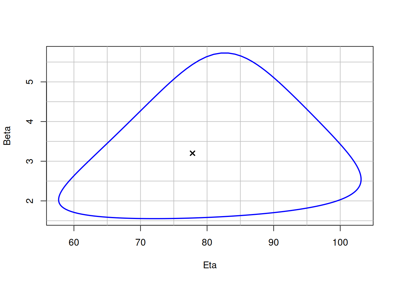
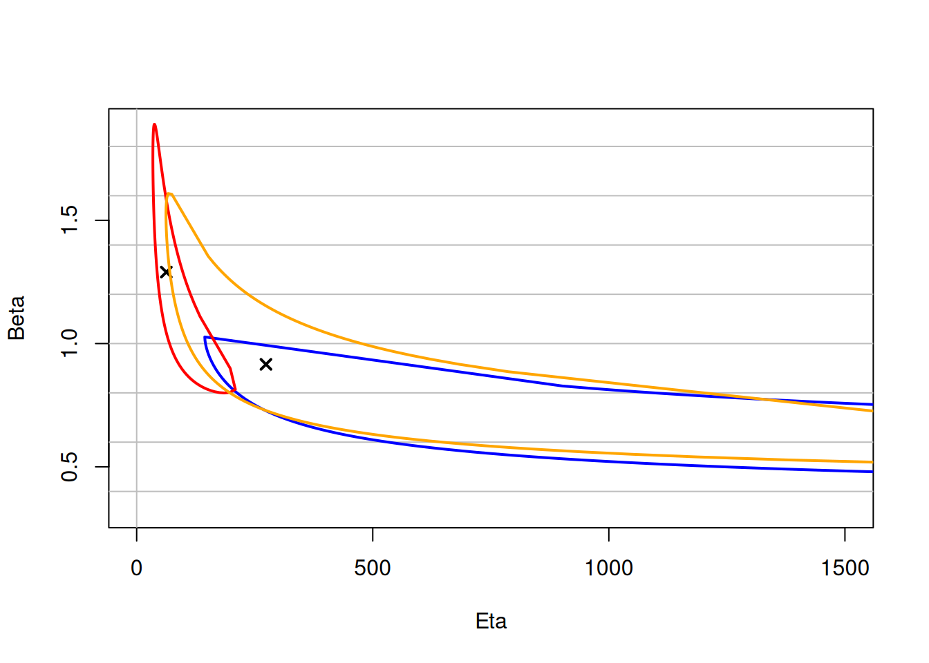
A **contour plot** shows the joint confidence region for $\beta$ and $\eta$. Overlapping contours indicate that two distributions are not significantly different at the chosen confidence level.
```{r}
#| results: hide
failures <- c(30, 49, 82, 90, 96)
obj <- wblr.conf(
  wblr.fit(wblr(failures, col = "blue"), method.fit = "mle"),
  method.conf = "lrb"
)
plot_contour(obj, CL = 0.9)
```
### Comparing Contour Plots
```{r}
#| results: hide
obj1 <- wblr.conf(
  wblr.fit(wblr(dat1, col = "blue"),   method.fit = "mle"),
  method.conf = "lrb"
)
obj2 <- wblr.conf(
  wblr.fit(wblr(dat2, col = "red"),    method.fit = "mle"),
  method.conf = "lrb"
)
obj3 <- wblr.conf(
  wblr.fit(wblr(dat3, col = "orange"), method.fit = "mle"),
  method.conf = "lrb"
)
plot_contour(list(obj1, obj2, obj3), CL = 0.9, xlim = c(1, 1500))
```
Overlapping contours at 90% confidence level indicate that the three failure modes are not statistically distinguishable at this confidence level.
## Summary
**Key takeaways:**
- The Weibull CDF: $R(t) = e^{-(t/\eta)^\beta}$.
- $\beta < 1$: decreasing rate (infant mortality); $\beta = 1$: constant (exponential); $\beta > 1$: increasing (wear-out).
- At $t = \eta$: $F(\eta) = 63.2\%$ for any $\beta$.
- Suspensions are units that did not fail; always include them in the analysis.
- MRR and MLE often give slightly different fits; use the AD statistic to choose.
- Weibayes is appropriate for scarce data with prior knowledge of $\beta$.
- 3-parameter Weibull handles failure-free periods.
- Multi-plots and contour plots are powerful tools for comparing distributions.