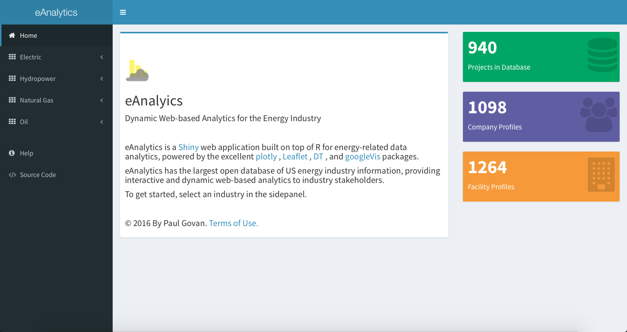
Home
Launching the app first brings up the Home tab, which is basically a landing page that gives a brief introduction to the app and includes three value boxes for the current number of projects, companies, and facilities in the database.
Profile
The Profile tab contains a number of interactive maps with information about facilities for the selected industry. The figure below shows the Profile tab for the Natural Gas Industry.
Multiple options are currently available for customizing the maps. Choose a preferred size or color variable in the movable well panel, select from different basemaps via the lower-right control, and click on a specific facility to view additional information.

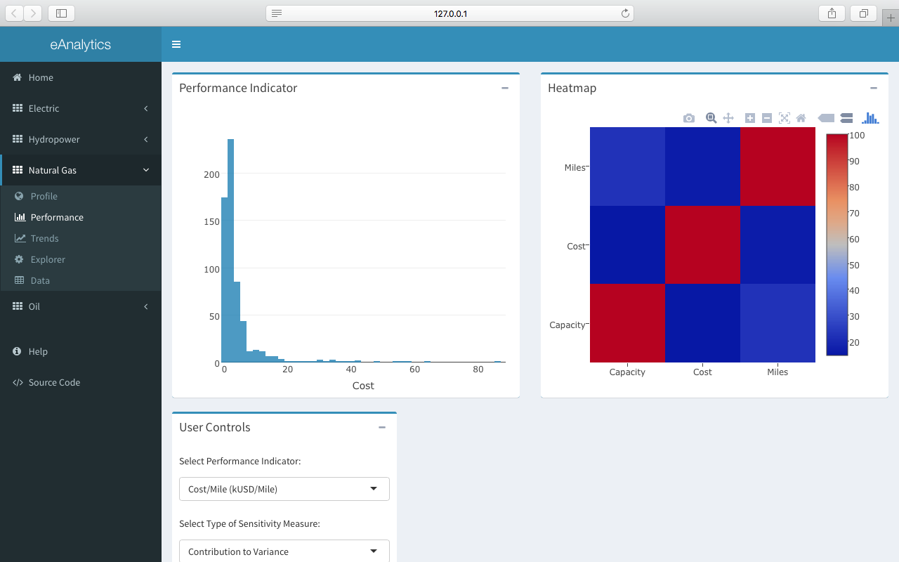
Performance
The Performance tab tracks a number of Key Performance Indicators (KPIs) for the selected industry. The following figure shows the Performance tab for the Natural Gas Industry.
Trends
The Trends tab contains multiple interactive time-series charts of financial information for the selected industry. The following figure shows the Performance tab for the Electric industry.
The time-series chart in the Trends tab is linked to the data table shown in the Data tab. Searching, filtering, and sorting the data in the data table will automatically update the time-series chart with the selected data.

Data
The Data tab contains interactive datatables of information for the selected industry. The data can be searched, filtered, and sorted as required. The selected data can then be copied to the clipboard, downloaded to a csv or pdf file, or sent to a local printer. The figure below shows the Data tab for the Hydropower industry.